Data: Management and Visualization for Better Business Decision Making
ELISA CRISCIONE, Founder & CEO of Digital Coffee Future, shares practical strategies for how specialty coffee companies can collect, manage, and visualize data in this two-part series. You can read the first feature in this series, Data: Build a Smarter Data Collection System for Your Coffee Business, here.
Most coffee businesses start collecting data enthusiastically, only to abandon the effort months later when spreadsheets become overwhelming and insights remain elusive.
As we explored in the first article of this series, breaking this frustration cycle requires a strategic and iterative approach: start with strategic questions, deliberately limit initial indicators to three to five key metrics, and refine through trial and error. Companies that build this foundation for their data collection discover that the following steps become a natural evolution of this systematic groundwork.
Part 1
Data management: When Data Points Start Talking to Each Other
Individual data points are like single building blocks. They are useful but limited in what they can accomplish alone. When you create proper connections between datasets, they become significantly more valuable.
Consider a roastery tracking three separate datasets: technical roasting parameters, customer order patterns, and seasonal green coffee availability. When these datasets connect through proper data management, new insights emerge. The roastery might discover that coffees from certain origins with specific flavor profiles have high repurchase rates, but only during months when competing seasonal offerings aren't available. This insight, difficult to see in isolated data, directly informs both production planning and marketing timing.
Connected data also eliminates the inefficiencies that accumulate when information exists in silos. In my work as a data consultant with coffee companies, I regularly observed two challenges: data duplication and disconnected systems.
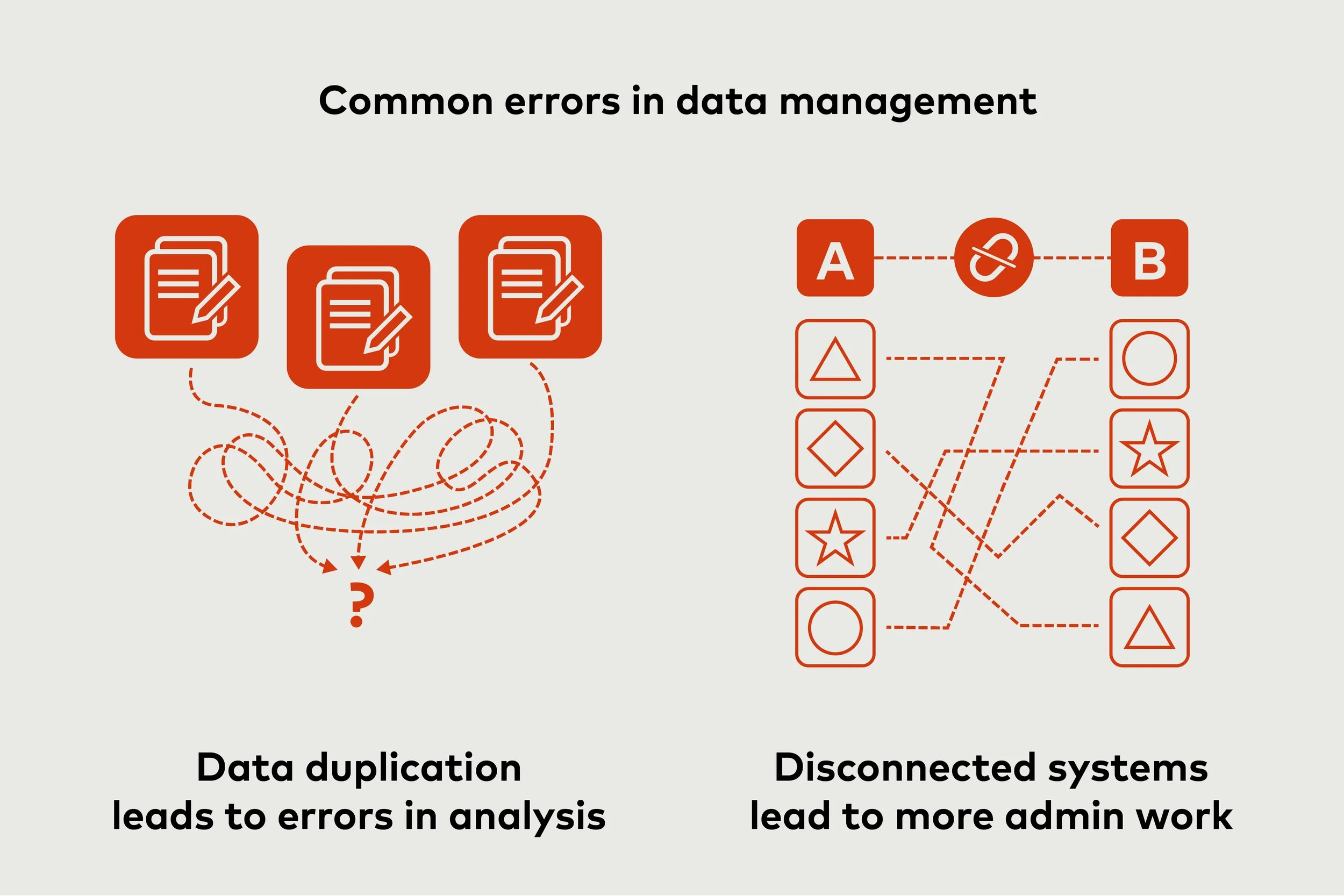
Data duplication: Without realizing it, many coffee businesses collect the same information from multiple sources using different formats. For example, the same coffee importer could be tracking a lot as "Ethiopia Yirgacheffe #247" in accounting logs, but as"ETH-YRG-247" in their inventory systems. This creates effort for sales and accounting teams when reconciling data, or worse, creates errors in analysis if the duplicate data goes unnoticed. You can eliminate repetitions and create more valuable links by standardizing naming conventions or formats.
Disconnected systems: Companies invest in digital tools for different purposes, but their benefits can become headaches if their systems don’t talk to each other. Although each tool may perform its function seemingly well, a lack of system integration creates more administrative work. For example, one of your tools might generate CSV files whose data must be manually formatted before it can be uploaded to another platform. Assess your current system or systems and if there are gaps, see if API or third-party platforms can connect them to avoid additional workload.

Building internal data capacity
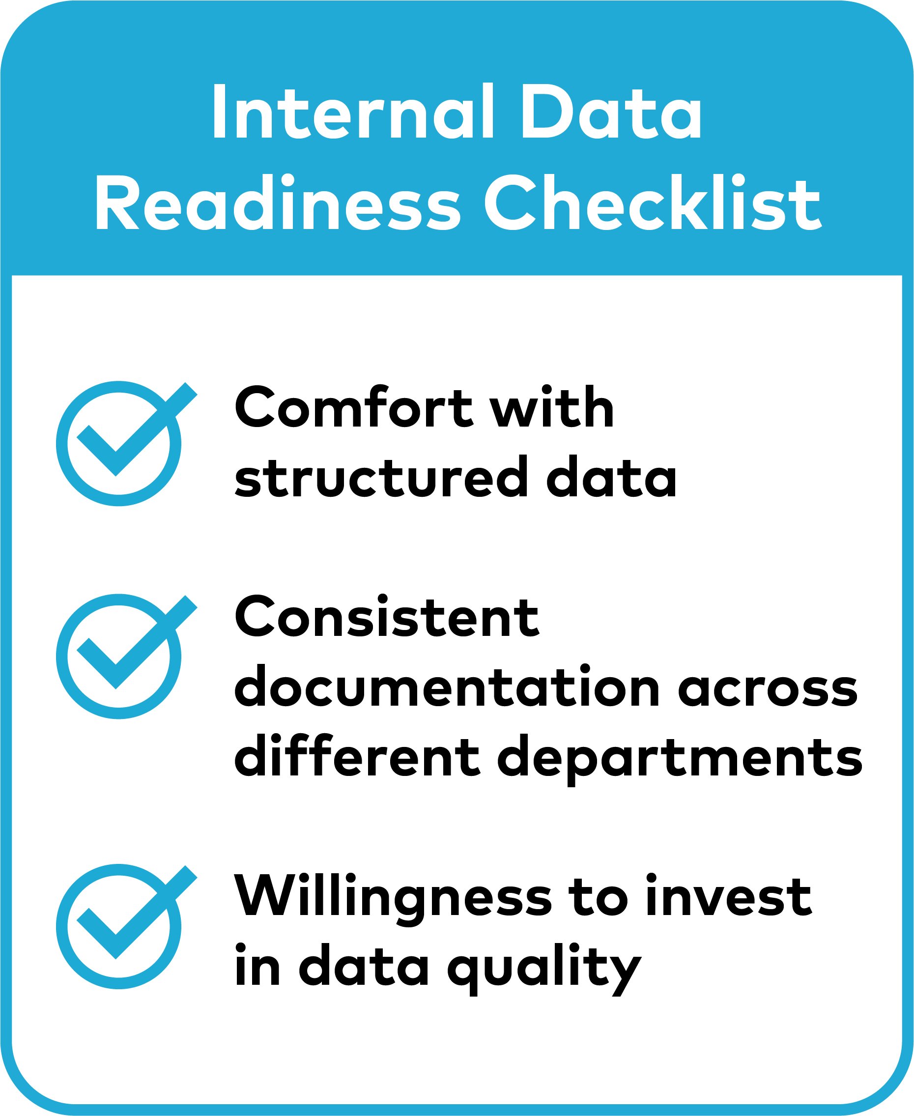
Data management implementation also reveals important information about how ready you are as a company to make data-driven decisions. Companies might want to ask themselves:
How comfortable are team members with structured information?
Do different departments have consistent approaches to documentation and record-keeping?
Are people willing to invest time in data quality when they understand the long-term benefits?
These questions matter because successful data management requires internal alignment, not just technical systems. When team members understand how connected information makes their jobs easier, they see data as a useful tool rather than an administrative burden. When teams trust that information is accurate, current, and comprehensive, they become more willing to base important decisions on data insights. This confidence indicates that your foundation is solid and ready to support the next phase: transforming well-managed information into actionable visualizations.
Part 2
The Visualization Advantage: Turning Your Data into Strategic Insights
Successful data management allows you to unlock a powerful aspect of business intelligence: data visualization. This happens when you transform well-managed information into actionable tools that guide strategic decisions.
Data visualization encompasses any method of presenting information in formats that make patterns, trends, and relationships apparent. This ranges from simple but powerful charts tracking daily performance metrics to sophisticated dashboards that integrate multiple operational systems to generate reports for stakeholders, or explore advanced analytics for strategic planning. The key is matching your approach to your operational needs, team capacity, and growth stage.
Let’s look into three possible examples:
A small coffee farm tracking processing methods and quality scores might achieve significant insights with well-designed Excel charts that clearly show correlations between specific practices and cupping results. The visualization doesn't need to be technologically sophisticated to drive better decisions.
Medium-sized operations, such as roasteries serving multiple wholesale accounts or cafés with several locations, often benefit from do-it-yourself business intelligence (BI) platforms. These tools offer more advanced integration capabilities and real-time updates while remaining accessible to teams without extensive technical backgrounds. They also provide flexibility to adapt visualizations as business needs evolve.
Larger companies, such large farmer cooperatives or international traders with complex supply chains, multiple product lines, or extensive distribution networks might require custom-built platforms or enterprise-level business intelligence solutions. These investments make sense when visualization needs are sophisticated enough to justify the development and maintenance costs.
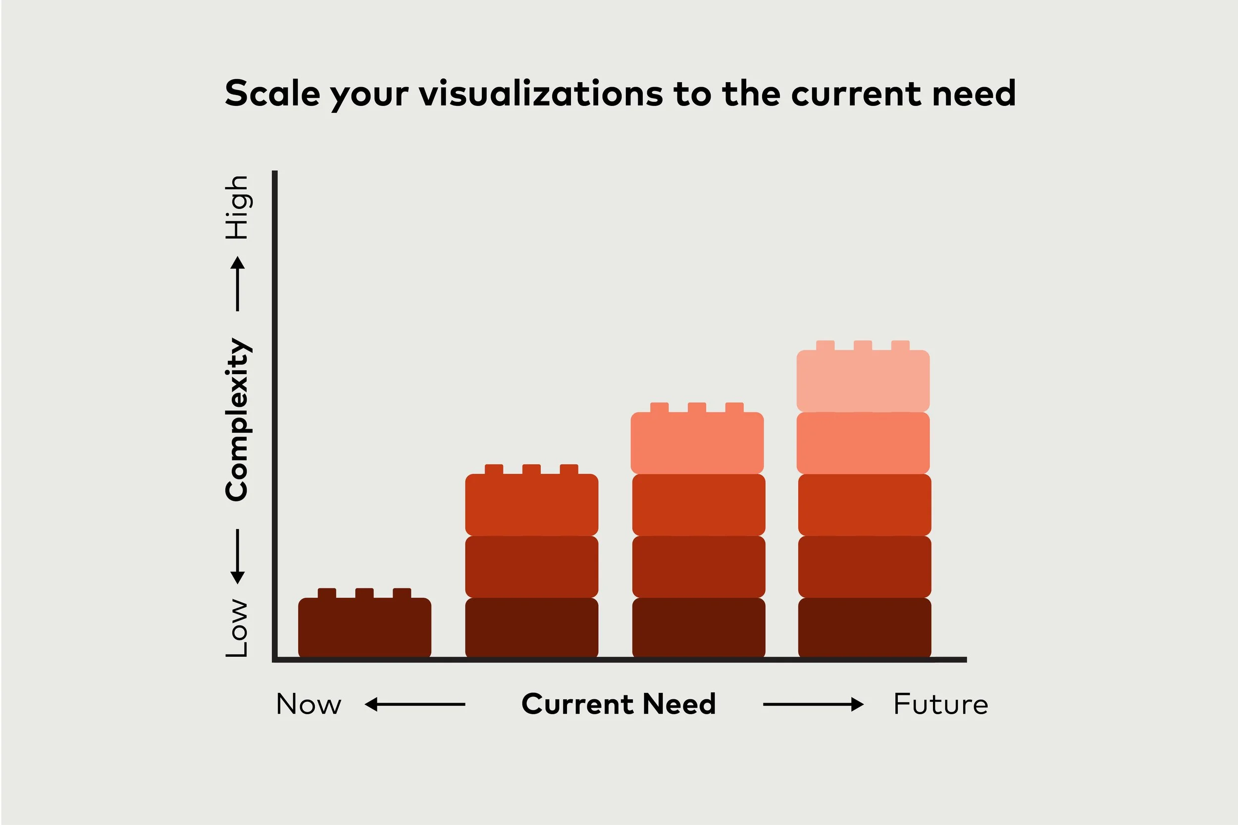
Keep in mind that more complex visualizations are not necessarily better; consider the visual that will give you the best insights. Your tools may become more complex, as you better understand the relationships in your data.
The Step-By-Step Advantage
Regardless of scale, the most effective approach is starting simple, testing initial results, adjusting –when relevant– and building complexity gradually.
Indeed, starting with simple charts and basic dashboards allows you to test whether your data strategy is actually generating the insights you expected when you designed your collection and management processes.
Sometimes visualization reveals gaps in your underlying data that weren't apparent during earlier phases. You might discover that seasonal trends require longer historical periods than you initially collected. Or that supply chain optimization requires connecting datasets you hadn't considered during your initial system design.
These discoveries are valuable learnings that help refine your data strategy. The trial-and-error approach that guided data collection and management continues to be essential during visualization implementation. When charts don't reveal expected patterns, or when dashboard insights don't translate into clear action steps, it's worth evaluating whether adjustments to earlier phases would improve outcomes.
Making Visualization Work: Avoiding Pitfalls and Measuring Success
It is important to also be aware of several recurring mistakes that limit visualization effectiveness, regardless of the tools or platforms being used. These can include:
Information overload. Businesses excited about their newly connected data often try to display every available metric on a single dashboard or chart. But comprehensive isn't the same as useful. Effective visualization focuses on the specific metrics that inform immediate decisions rather than displaying everything that can be measured.
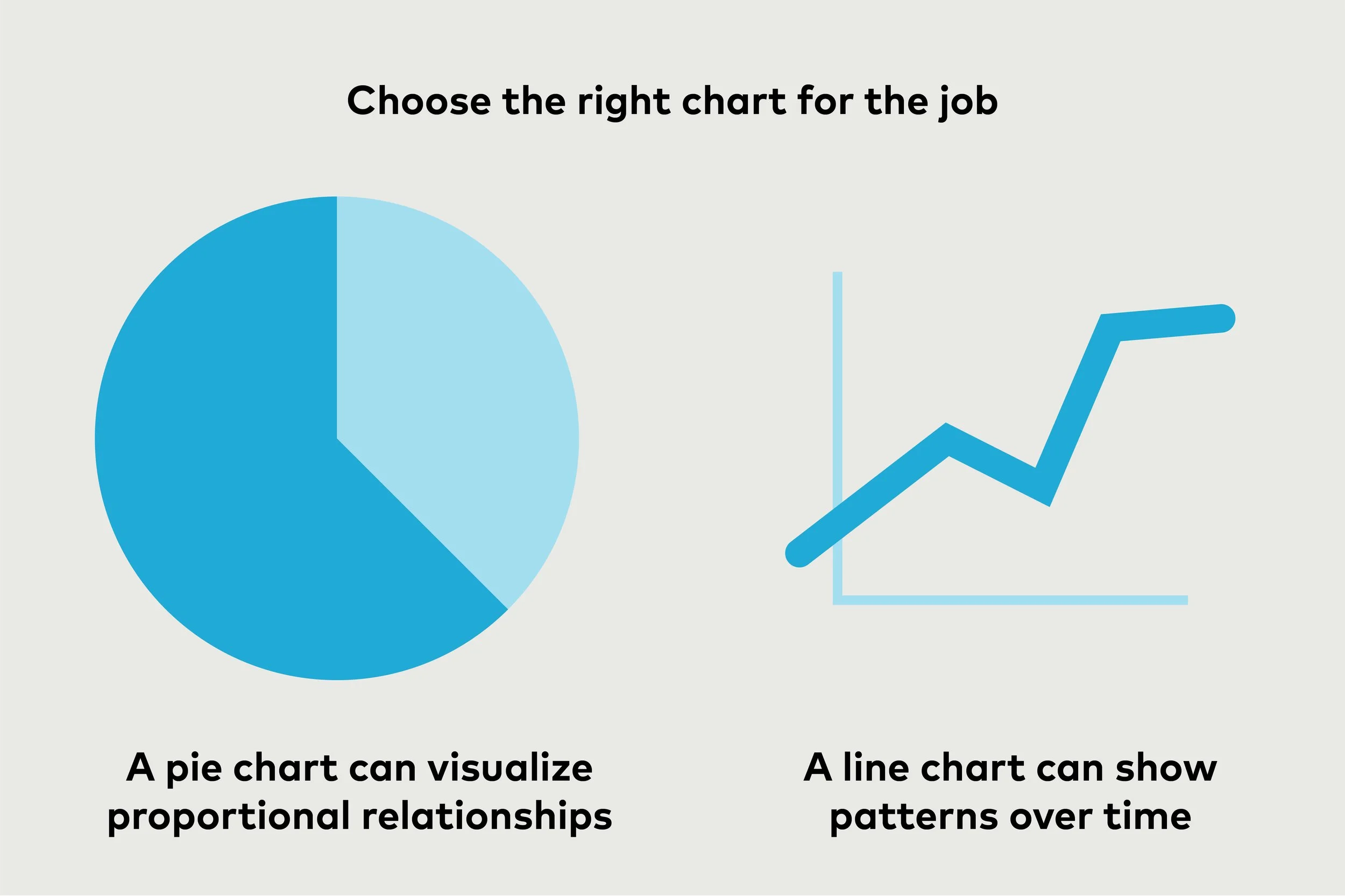
Choosing the wrong charts: Companies often pick chart types that look impressive but don't match the data story. Three-dimensional charts might appear more sophisticated, but they often make it harder to identify actual patterns. Complex visualizations with multiple colors and design elements can obscure rather than reveal insights.
Failing the “so what” test: Most importantly, many businesses create visualizations that don't add actual value to their operations. Every chart, graph, or dashboard element should answer the question: "So what do I do with this information?" If a visualization shows interesting patterns but doesn't suggest specific actions or decisions, it's probably not contributing to operational improvements.
So, what does success look like when it comes to the best way to make the connection between information and action immediately obvious? When customer traffic patterns are displayed clearly, staffing decisions become more straightforward. When roasting data is clearly presented, it becomes easier to understand how roast profiles influence what you taste at the cupping table. When you track supply chain data for coffee and non-coffee products, it's easier to make operational decisions—ensuring that you have the right products at the right time.
The Cultural Transformation Within Your Organization
Effective data visualization catalyzes broader organizational changes in how decisions are made and how teams communicate about operational challenges. When visual insights become part of regular discussions, coffee businesses often discover they're asking better questions and making more objective decisions. Teams start asking better questions. Instead of asking "what were our sales last month?" they are curious to understand "how do seasonal patterns affect customer preferences for different roast profiles?"
The most successful coffee businesses combine industry expertise with data-driven insights to make decisions that are both well-informed and practically grounded. Charts make information accessible to team members who might be intimidated by spreadsheets. When insights are presented clearly, people naturally suggest additional analysis. Teams that previously relied primarily on intuition and experience begin incorporating data insights into their decision-making processes, enhancing their professional judgment with experiential knowledge.
When visualization becomes integral to operational decision-making, the entire investment in data collection and management proves its value. The systematic approach that began with strategic data collection reaches its full potential when insights drive consistent operational improvements across the business.
The companies that embrace this progression position themselves to make better decisions, identify opportunities faster, and build sustainable competitive advantages in an increasingly complex and volatile industry.
This concludes part two of a two-part series on data for coffee companies by ELISA CRISCIONE. Start here to learn about the principles of data collection.